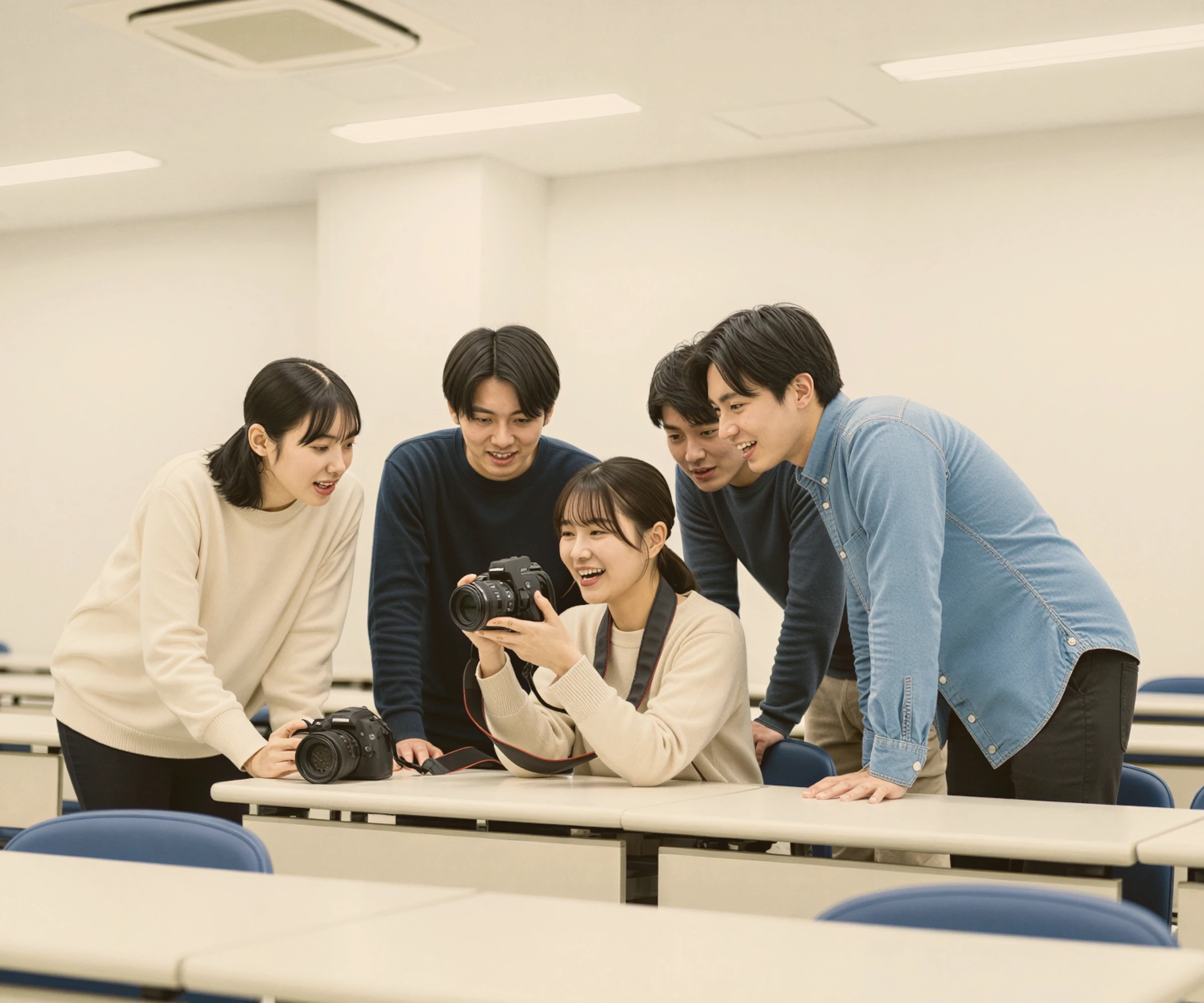
Direction
Directing Non Professional Talent: A Practical Field Guide for Better Creative Results
Feb 1, 2026
5 min read
Retouching
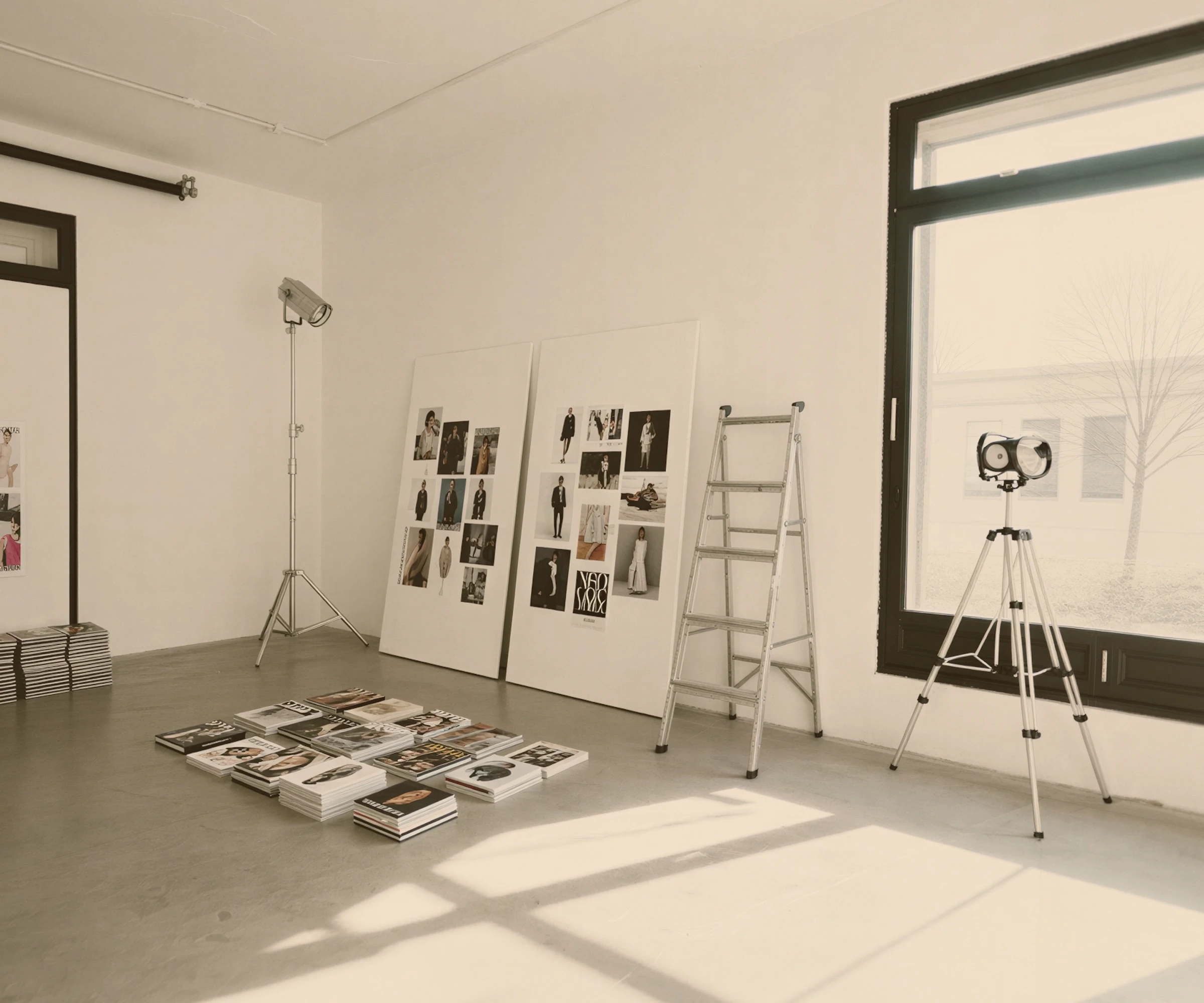
From Culling to Final Export: Our Complete Retouching Process and Workflow Explained
Jan 25, 2026
8 min read
Your client's monitor is probably wrong. Their phone's display is definitely wrong. Here's how we manage colour expectations from brief to delivery.
CATEGORY
Photography
DATE
READ TIME
5 min read
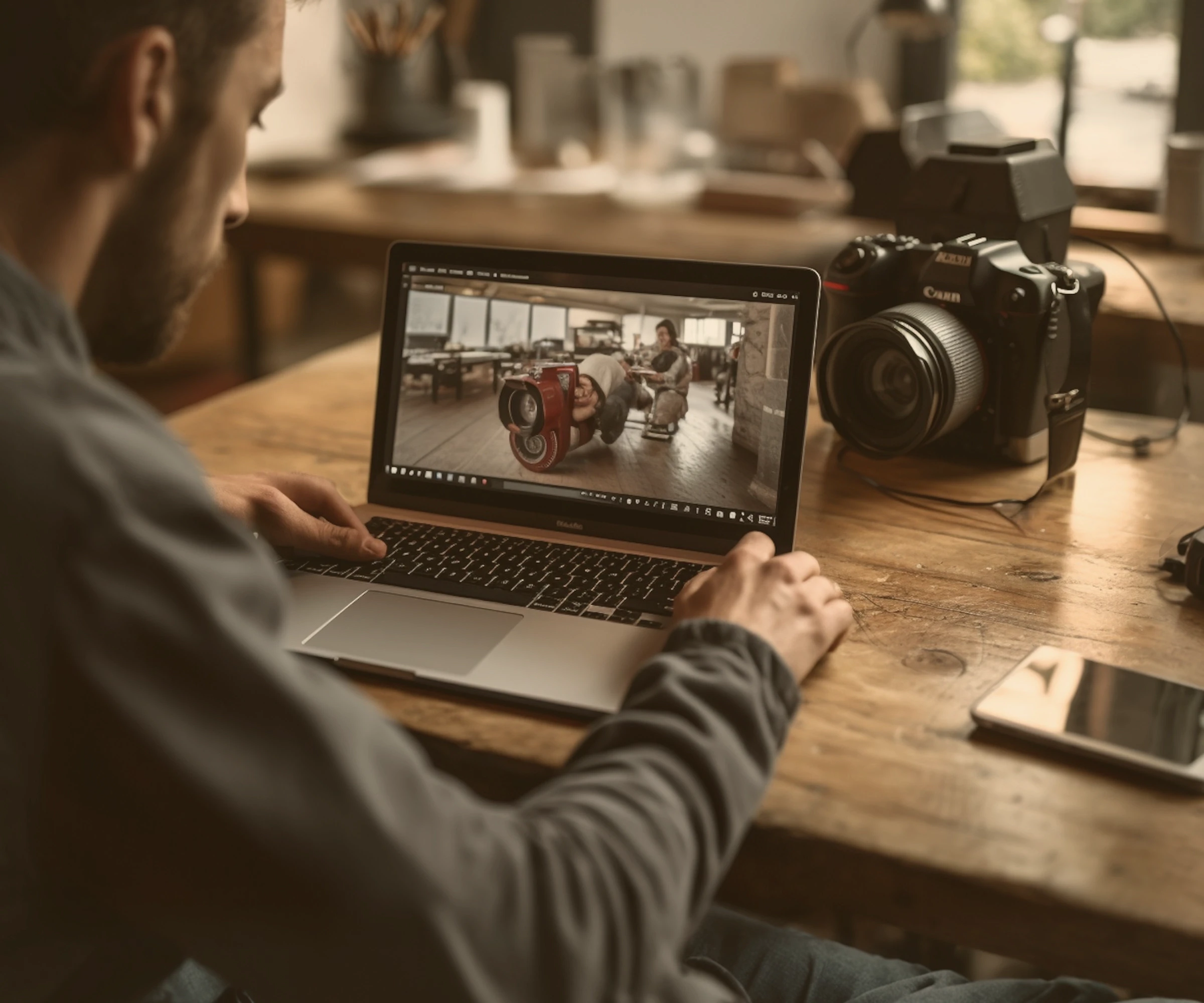
A photographer and their client can look at exactly the same image and see different colors. Not because one of them has a vision problem, but because the screens they are using display the image differently, sometimes dramatically so. This is not a marginal technical footnote. It is one of the most common sources of miscommunication in creative projects, and almost no one discusses it explicitly until something has already gone wrong.
Color science is not a rarefied specialities. It is practical knowledge that affects every image we make and deliver. Understanding it, at least at a conceptual level, makes the difference between a client review process that is clear and productive, and one in which the photographer and client are arguing about something neither of them can quite name.
A color space is a defined range of colors that a device or file can represent. The most common color spaces in photography are sRGB (the standard for web use), Adobe RGB (a wider gamut used in professional retouching and print), and ProPhoto RGB (an extremely wide gamut used in raw processing). The differences between these spaces are significant. An image saved in Adobe RGB and displayed by a device expecting sRGB will appear visually desaturated because the wider color information is being compressed into a narrower display range.
An ICC profile is the mechanism by which color space information is embedded in or interpreted by a file. When a file has a correctly embedded profile, color managed software can display it accurately regardless of which color space it was created in. When profiles are stripped or ignored, which happens frequently in web browsers, social platforms, and email clients, the image may display incorrectly.
In practical terms, we produce our final retouched masters in Adobe RGB for maximum color information. We deliver web ready JPEGs in sRGB with the profile correctly embedded. We note in our delivery documentation which files are for which use, and why. Most clients have never been told this, and many have been using Adobe RGB files for web use without realizing it.
Every client reviews images on a different device. We calibrate ours. That gap, between what we made and what they are seeing, is the color science conversation most studios skip.
Display calibration is the process of adjusting a monitor to display color accurately according to a defined standard. A calibrated monitor shows images as they actually are, meaning the colors you see match the color values in the file. An uncalibrated monitor may show images that are too warm, too cool, too bright, too dark, or with shifted colors that the photographer never intended.
Professional photographers calibrate their monitors regularly, typically monthly, using hardware colorimeters. Most clients do not own a colorimeter and have never calibrated their screens. The laptops, tablets, and phones they use to review images have display profiles that vary widely. A MacBook Pro set to its "Vivid" display mode shows significantly more saturated colors than a calibrated sRGB monitor. An older Android device may render colors so differently that comparing feedback becomes almost meaningless.
This is not a solvable problem in the traditional sense. We cannot calibrate every client’s device. But naming it explicitly transforms the feedback process. When a client says "the colors look a bit flat", we ask what they are viewing on. The answer tells us whether we are addressing a real problem in the file or a display interpretation issue.
Soft proofing is the technique of simulating, within retouching software, how an image will appear in a specific output environment, such as a particular paper and printer combination or a specific display profile. We use soft proofing for all images intended for print production to ensure that what we see on screen corresponds to what will come off the press.
For digital delivery, we proof against an sRGB display profile and against a standard consumer screen that has not been color managed. This worst case view tells us if the image holds up in the conditions most clients will actually view it in, rather than only on our calibrated studio monitors.
The color conversation begins at the brief stage, not the delivery stage. When a client shares reference images with a specific color temperature or tonal character, we establish whether those references are themselves color accurate, and we note the color direction we intend to pursue. This creates a shared reference point that we return to during the retouching review.
During the proof review, we ask clients to view images in a browser with color management enabled, on a device they consider reliable. We provide a simple colored control swatch alongside the proof set, a known neutral grey that allows us to diagnose display issues if feedback seems inconsistent with what we are seeing in the file.
The most impactful single step any client can take is to view proof images in a consistent, controlled environment, using the same device and the same lighting conditions every time. Reviewing images on a phone in sunlight and then again on a laptop in a dark room, and comparing the two, is not a useful process.
If you commission photography regularly and the color accuracy of delivery is important to your business, a hardware colorimeter for your primary review monitor is a worthwhile investment. The cost is modest relative to the value of the projects it supports, and it eliminates a significant category of miscommunication from the client photographer relationship.